

Project Overview
Wholesalepoint.com is a large e-commerce website specializing in home medical supplies. They sell over 10,000 products and their general target market skews older, specifically towards those who are middle aged and are caretakers for the elderly.
An SEO guru, who I had previously worked with, was doing work for them; he was increasing their traffic however their conversion rates were horrendous. Unfortunately, their previous website was not a good user experience and they were having steep drop-offs. I was brought in to redesign their website with the mandate to help increase their conversion rates. Luckily for me the SEO had already done a lot of the research and identified several of the problem areas.
Process
I started by spending several hours running through their website identifying all the problem areas. I compared my notes against the Google Analytics reports.
I interviewed their customer service team; I did not have access to their customers so this was the next best thing. After interviewing the team and compiling the information I narrowed down their primary issues:
Search – their search functionality was weak. On a site that large having a strong and suggestive search makes it easier for users to find products.
Navigation – with such an extensive product line their products had categories, sub categories, tertiary sub categories, etc. A single product might have 15 different fly-outs making it difficult to navigate.
Add to Cart – there were no clear and concise buttons.
Suggestive selling – they were missing opportunities by not being able to suggest different items as a user browsed the site.
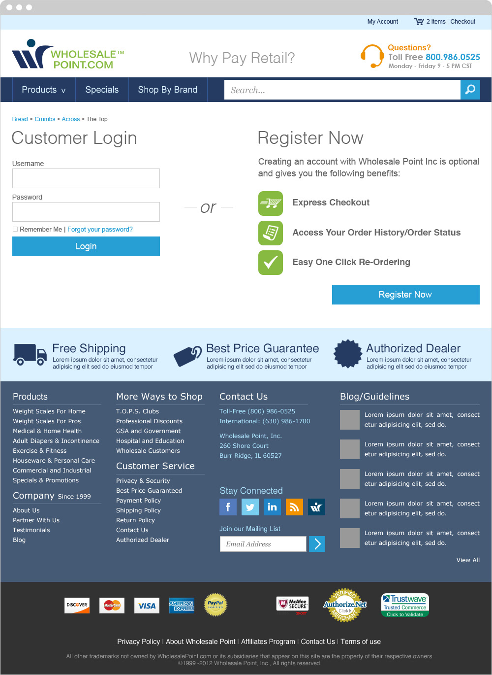
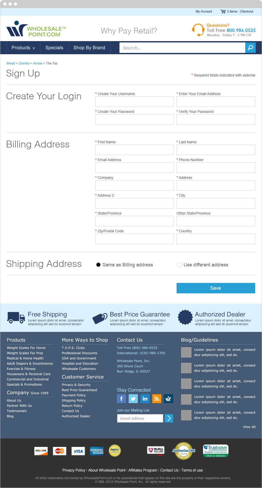
No User Accounts – every time a user tried to buy an item they had to enter all their information repeatedly. Several customers became annoyed and would actually call customer service and do phone orders instead of buying online.
Responsive – At the time I was brought in they did not have a responsive website, yet according to analytics over 25% of their visitors were coming in through a mobile device.
Results
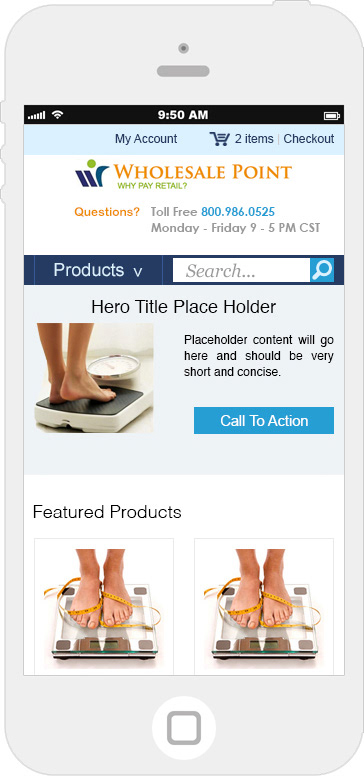
Mobile Home Screen
When I put the designs together the owner wanted the customer service phone number to be easily visible, as you can see it is easy to see yet does not hinder the ability to see other aspects of the page.
I researched several e-commerce websites and I came to the conclusion that the easiest way to allow the user to find products was to stress the search functionality. This allowed the user to find what they wanted much easier. Also, in the mobile version we left a simplified products dropdown. It had the seven primary product categories. After collaborating with the SEO we agreed it made sense to create a giant footer that had all the primary links. This helped users as they scrolled through pages to have as many navigation options as possible as well as helped with SEO.
I researched several e-commerce websites and I came to the conclusion that the easiest way to allow the user to find products was to stress the search functionality. This allowed the user to find what they wanted much easier. Also, in the mobile version we left a simplified products dropdown. It had the seven primary product categories. After collaborating with the SEO we agreed it made sense to create a giant footer that had all the primary links. This helped users as they scrolled through pages to have as many navigation options as possible as well as helped with SEO.
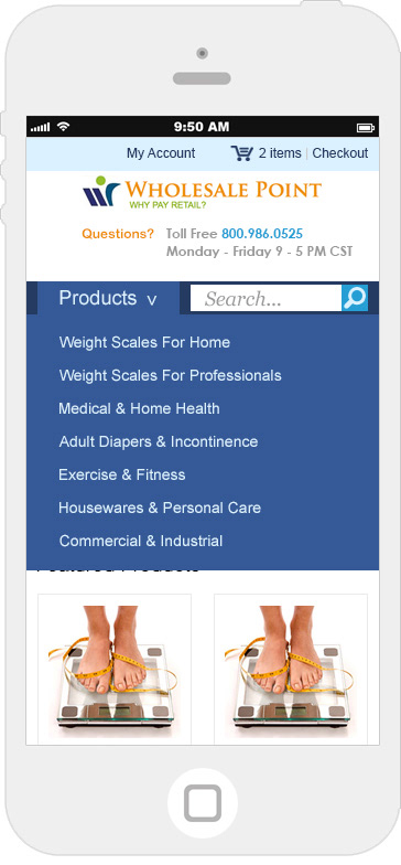
Mobile Home Screen Menu View
Mobile Home Screen Additional View

Mobile Home Screen Footer Navigation

Home Page Desktop View
The home page is filled with suggestive selling options. Wholesale Point was regularly running sales or adding new products therefore it made sense to have as many product options as possible without overwhelming the user. Also, the developer on the project instituted cookies that remembered what users looked at so the different items were dynamic and showed previously viewed or related items.

Desktop Home Page Menu Dropdown
While the owner liked the search-based navigation he was insistent that the products in the navigation have the drilled down options for the user to click on. I worked with one of the account managers to narrow everything down in their database to make it easier for the user to find what they want.

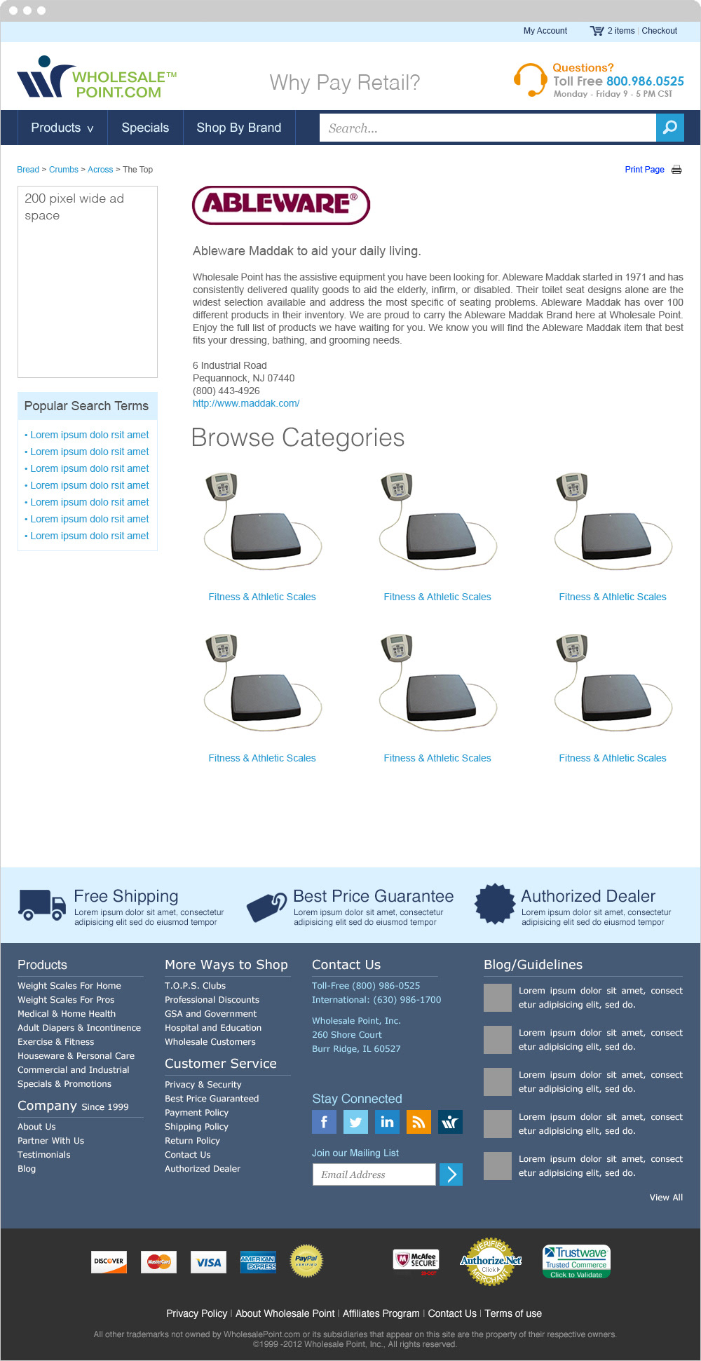
Brand Page
One of the navigation options allows the user to view all the products by a single brand. We put an introductory paragraph at the top for SEO purposes. The left side of the page has a space for homemade banner ads, below are “popular search terms.” The search terms did two things; they assisted in SEO and gave the user additional related options to view.
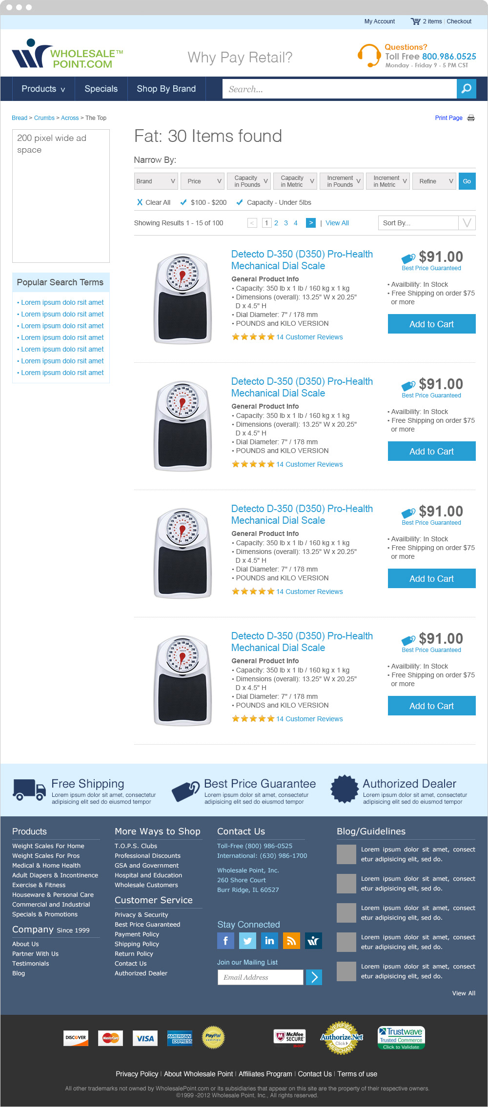
Search Results
The search results was always meant to be the primary way a user got to a product. When I designed the page, I added a filtering system across the top, since the design large e-commerce sites have since moved to a left hand filter.
However, the most important aspects are the product listings. I designed them to have a nice product shot, list the name, a few details, show a quick customer review, tell the user whether an item is in stock and lastly have a clear “Add to Cart” button.
However, the most important aspects are the product listings. I designed them to have a nice product shot, list the name, a few details, show a quick customer review, tell the user whether an item is in stock and lastly have a clear “Add to Cart” button.
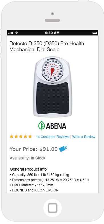
Product Page Mobile View
For the mobile product page I made the hero front and center with all of the important information below. I admit I made one error; the “Add to Cart” options and button should have been about the product info.
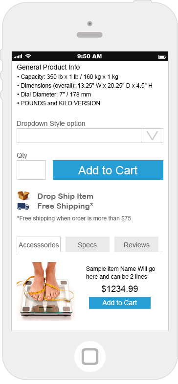
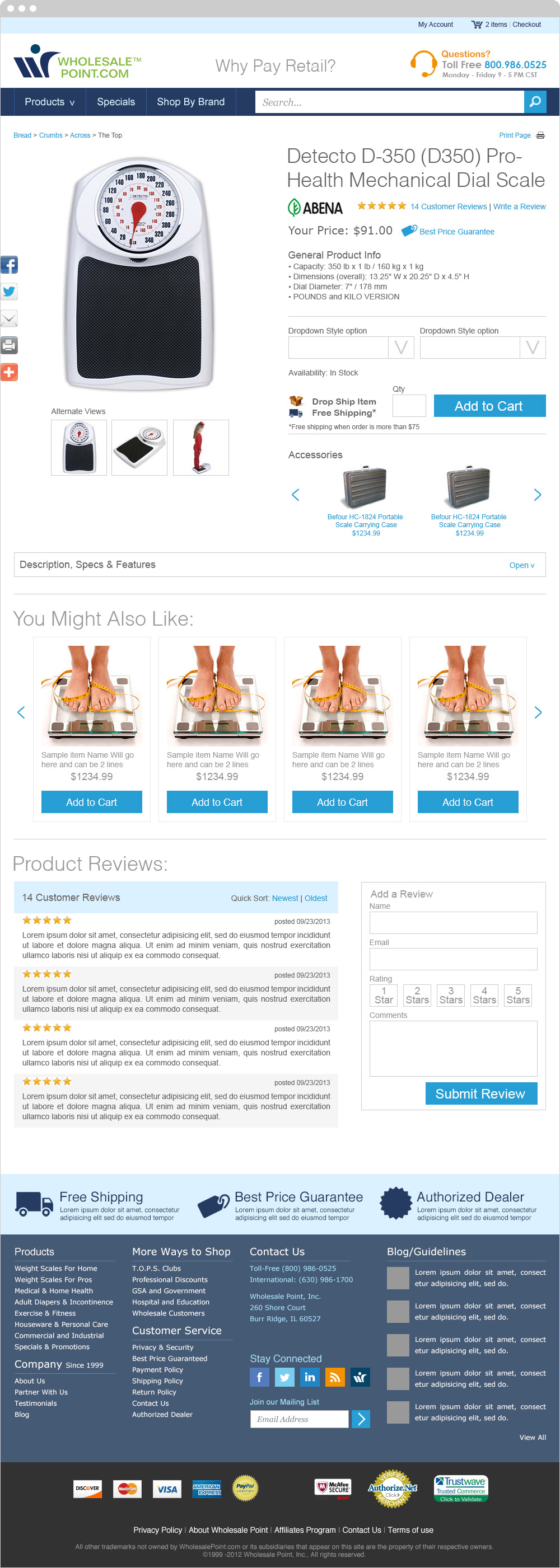
Product Page
The product page required several pieces of information. The SEO wanted to stress user reviews, as the more fresh content each page received the better it would help search rankings. The owner wanted the availability; drop shipping and free shipping options to be stressed. I thought putting the Accessories directly below the “Add to Cart” would make them more noticeable.
Shopping Cart
I did a basic shopping cart page; my goal was to try to stress the Checkout buttons. I also added an Estimate Shipping area, while several items qualified for free shipping there were several more that did not. Shipping could be very expensive depending on the size of the item(s) purchased. Lastly, I added a little area to try a final upsell and hopefully entice the user to make additional purchases.

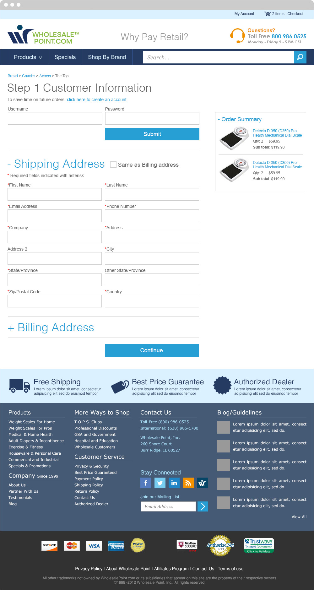
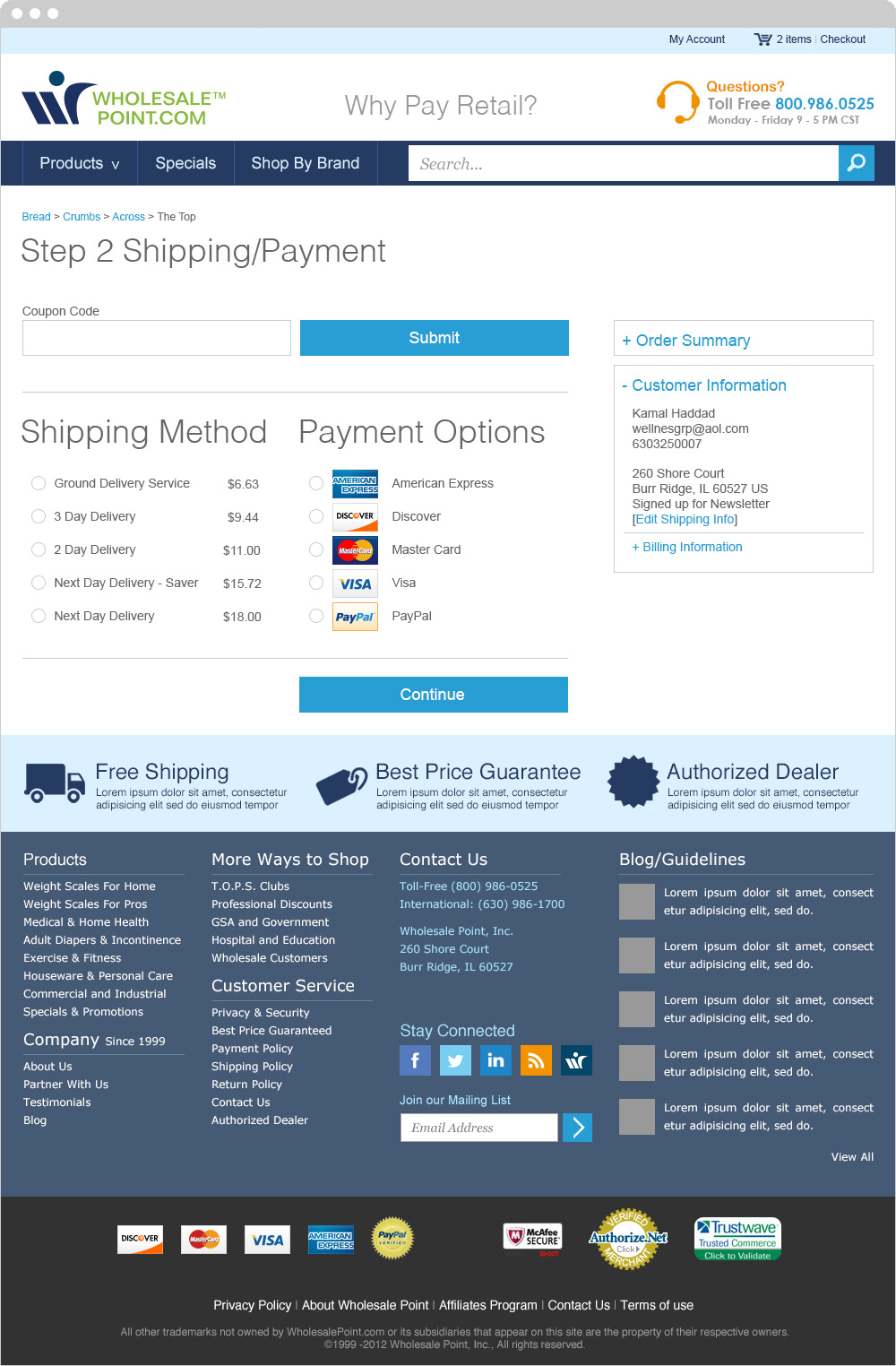
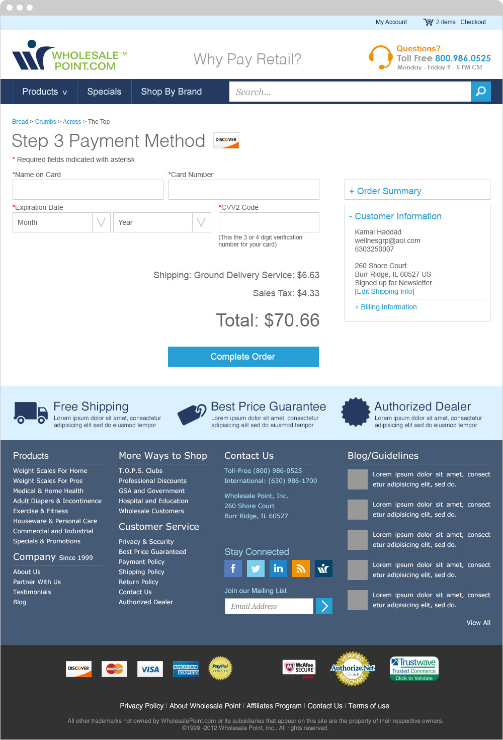
Checkout Process Step
I looked at several e-commerce checkouts and I came up with a three-step process. Step 1 Shipping and Personal info, Step 2 Shipping type and Payment choice and Step 3 Payment info. I also added a customer account, this would store user information, and unfortunately the client could not afford to store previous orders or create a repeating order.
Customer Login
Sign Up
The Sign Up page was intentionally modeled after the Checkout Process Step 1 page.
Contact Us
