
Project Overview
The Team Mobile app is Viewpoint’s flagship mobile app. It is a powerful app that handles several aspects of construction project management. However, it had a fatal flaw in its navigation. The navigation required the user to go through several pages to get to where they want. Also, in the primary or hamburger menu the user was very limited with what they could do. After a major customer complained to the mobile lead I was tasked with updating the navigation.
If a user wanted to navigate from the home page to an RFI they would have to click the Logs button at the bottom of the screen. They would be in the Logs landing page, they would then have to click RFIs which puts them into the RFIs list and finally they would click the RFI they wanted to see.

Process
The project was broken down to 3 phases:
• Discovery
• Design
• Usability Testing
Discovery
While this was far from my first architecture or navigation project, this was my first one for a mobile application, especially one with a strong user base. I was lucky I had a developer with over 10 years of mobile experience who I was able to work with. I also sat down with the mobile lead to discuss customer concerns. After the initial customer complaint she took it upon herself to speak to several customers and found out several others were very unhappy with the current navigation structure. She had gathered all her notes and shared them with me. Once I became familiar with all the concerns I became good friends with Google and read up as much as I could on mobile navigation patterns. Doing that helped me understand the necessity for the magic thumb zone on the bottom as well as have a singular location for all the sections.
While this was far from my first architecture or navigation project, this was my first one for a mobile application, especially one with a strong user base. I was lucky I had a developer with over 10 years of mobile experience who I was able to work with. I also sat down with the mobile lead to discuss customer concerns. After the initial customer complaint she took it upon herself to speak to several customers and found out several others were very unhappy with the current navigation structure. She had gathered all her notes and shared them with me. Once I became familiar with all the concerns I became good friends with Google and read up as much as I could on mobile navigation patterns. Doing that helped me understand the necessity for the magic thumb zone on the bottom as well as have a singular location for all the sections.
Design
For this project it wasn’t necessary to do any pencil sketches or wireframes as I had been doing design updates on the app for a while so I had all the elements and a sketch library. I put together the concept of the hamburger menu containing all the possible links. Also, the bottom navigation of favorites was recreating what currently existed.
For this project it wasn’t necessary to do any pencil sketches or wireframes as I had been doing design updates on the app for a while so I had all the elements and a sketch library. I put together the concept of the hamburger menu containing all the possible links. Also, the bottom navigation of favorites was recreating what currently existed.
Usability Testing
The screens and the step by step flows were completed so it was time for InVision prototypes (link below in project elements). I created a two part prototype, one used the original navigation and the other was the new concept. I had the user run through the same series of navigation tasks in both versions. I wanted to have them go though the original so they could have an accurate comparison to the newer version. I tested some users in person and other remotely over Go To Meeting. The best set of tests was when I was able to travel to Nashville and test users in the field, this lead to a discovery that will be detailed below. Thankfully I scored a 100%, every user preferred the new version to the original.
The screens and the step by step flows were completed so it was time for InVision prototypes (link below in project elements). I created a two part prototype, one used the original navigation and the other was the new concept. I had the user run through the same series of navigation tasks in both versions. I wanted to have them go though the original so they could have an accurate comparison to the newer version. I tested some users in person and other remotely over Go To Meeting. The best set of tests was when I was able to travel to Nashville and test users in the field, this lead to a discovery that will be detailed below. Thankfully I scored a 100%, every user preferred the new version to the original.
Project Elements
Prototype - If you go through the prototype, click in the upper right corner and you can return to the table of contents.
User Test - The document is set up to be printed and filled out during a live test.
Results
Video Walkthrough
I did a near two minute screen recording on my iPhone as a video walkthrough of the app on "Demo Mode." This shows how the app works by setting navigation favorites, setting home landing page, etc.
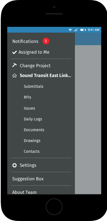
Hamburger Menu
The updated hamburger had links to every section of the app. The sections were either global (Notifications, Assigned to Me, Settings, etc) or project based (Submittals, RFIs, Issues, etc). This made it easier to move from section to section.
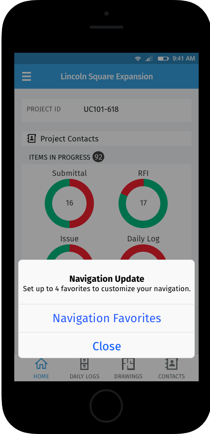
Update Notification
We wanted to users to know about the navigation changes and the ability to set their favorites. After 2-3 weeks of email warnings, when the new navigation went live users were greeted by this roadblock. It took users to the navigation favorites set up or allowed users to escape by hitting close. If a user did not set up favorites they would be reminded 2 more times over the next week before the roadblock would no longer appear.
Updated Home Page
This is a view of the updated home page with favorites set up.

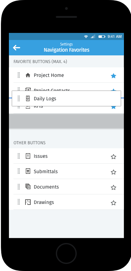
Set Navigation Favorites Part 1
When a user first arrives at the favorites set up they have the ability to select the stars on the right or drag and drop the navigation options into the target area.

Set Navigation Favorites Part 2
View of a favorites set up.

Set Navigation Favorites Part 3
A user can set the order of the favorites on the bottom through drag & drop.
Daily Logs
The original Daily Logs list had the old bottom tray navigation and did not have the hamburger menu. This new version allows easier access to other parts of the application.

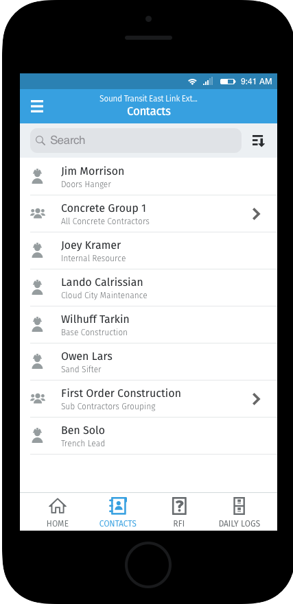
Contacts
The original contacts page did not have access to the hamburger menu or a bottom tray navigation.